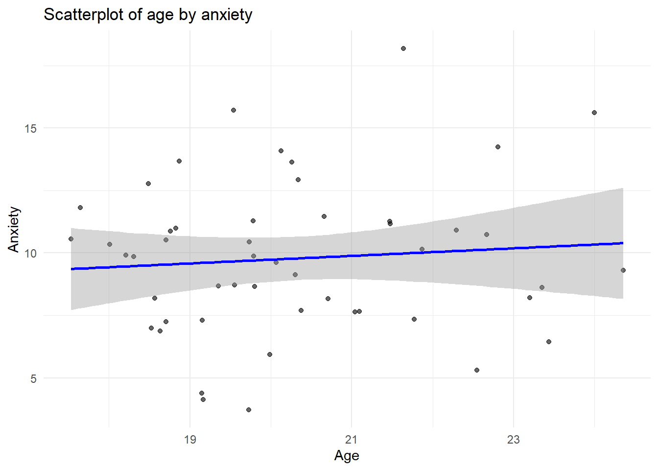
library(ggplot2)library(dplyr)# FALLBACKif(!exists("raw_data")) { raw_data <-data.frame(age =rnorm(50, 20, 2),anxiety =rnorm(50, 10, 3) + (rnorm(50) *0.5) )# Ensure column names match what we try to plot below# In a real app, we'd have a variable selector. # Here we pick the first two numeric cols.}# Dynamic Variable Selection for Plottingnum_cols <-names(select(raw_data, where(is.numeric)))if(length(num_cols) >=2) { x_var <- num_cols[1] y_var <- num_cols[2]ggplot(raw_data, aes(x = .data[[x_var]], y = .data[[y_var]])) +geom_point(alpha =0.6) +geom_smooth(method ="lm", se =TRUE, color ="blue") +labs(title =paste("Scatterplot of", x_var, "by", y_var),x = tools::toTitleCase(x_var),y = tools::toTitleCase(y_var) ) +theme_minimal()} else {print("Not enough numeric variables to plot.")}