| ResponseID | Status | Q1_Anxious | Q2_Calm |
|---|---|---|---|
| R_x12z | IP Address | Strongly Agree | Strongly Disagree |
| R_a99b | Completed | Agree | Disagree |
| R_c77d | Completed | Disagree | Agree |
| R_k22l | Spam | Strongly Agree | Strongly Disagree |
| R_p55m | Completed | Neutral | Neutral |
Module 4: The Final Manuscript
One Click to Truth
The “Raw Data” Reality
Most Psychology data comes from Qualtrics or SurveyMonkey. It is usually “wide”, messy, and full of text labels where you want numbers.
1. Simulating “Messy” Data
Let’s imagine we just downloaded this CSV from Qualtrics. It has:
- Metadata rows: Qualtrics gives 2-3 header rows.
- String Likert scales: “Strongly Agree” instead of 5.
- Reverse-scored items: An anxiety scale where “I feel calm” needs to be flipped.
|
ID |
Meta |
Item 1 |
Item 2 (Rev) |
|---|---|---|---|
|
R_x12z |
IP Address |
Strongly Agree |
Strongly Disagree |
|
R_a99b |
Completed |
Agree |
Disagree |
|
R_c77d |
Completed |
Disagree |
Agree |
|
R_k22l |
Spam |
Strongly Agree |
Strongly Disagree |
|
R_p55m |
Completed |
Neutral |
Neutral |
The Goal
We want a single file (manuscript.qmd) that contains everything: data loading, cleaning, analysis, and writing. When you render it, you get a submission-ready Word document.
Here is exactly how to do it.
1. The Raw QMD
Copy this code into a new Quarto file. This is your template.
---
title: "Untitled"
format: docx
---

```{r, echo=FALSE, warning=FALSE}
library(dplyr)
library(ggplot2)
library(flextable)

# 1. IMPORT DATA
# d <- read.csv("my_data.csv")
d <- data.frame(
  ID = 1:50,
  Sleep_Hours = rnorm(50, 7, 1.5),
  Anxiety = rnorm(50, 10, 3)
)

# 2. ADD ALL THE PROCESSING CODE HERE
clean_dat <- d %>%
  filter(Sleep_Hours > 0) %>%
  mutate(Group = ifelse(Sleep_Hours < 6, "Low", "High"))

# 3. CALCULATE STATS
mean_val <- round(mean(clean_dat$Anxiety), 1)
n_total <- nrow(clean_dat)
```

# Method

We analyzed data from `r n_total` students.

# Results

The mean anxiety score was `r mean_val`.

add other chunks for plots etc
2. The Logic Explained
A. The Setup Chunk
This is the most important part. It needs echo: false so it doesn’t show up in your paper.
- Load Libraries:
dplyr,ggplot2,flextable. - Data Wrangling: Do ALL your filtering and recoding here (
clean_dat). - Pre-Calculation: Save specific numbers (like
n_totalorp_val) as variables here. This makes your text cleaner.
B. Inline Code
Instead of typing “The mean age was 20.2”, you write:
Code: “The mean age was r round(mean(age), 1).”
Result: “The mean age was 20.”
C. Tables & Plots
We put the code for tables in their own chunks. We use flextable because it formats perfectly for Word.
3. The Output (What it looks like)
When you click Render, this is what appears in your Word doc:
Introduction
Sleep deprivation is a common issue on college campuses.
|
ID |
Sleep (Hrs) |
Anxiety |
|---|---|---|
|
1 |
3.46 |
14.89 |
|
2 |
7.56 |
12.03 |
|
3 |
9.36 |
8.47 |
|
4 |
7.25 |
9.70 |
|
5 |
7.83 |
10.22 |
|
6 |
9.42 |
5.35 |
Method
We analyzed data from 50 students.
Results
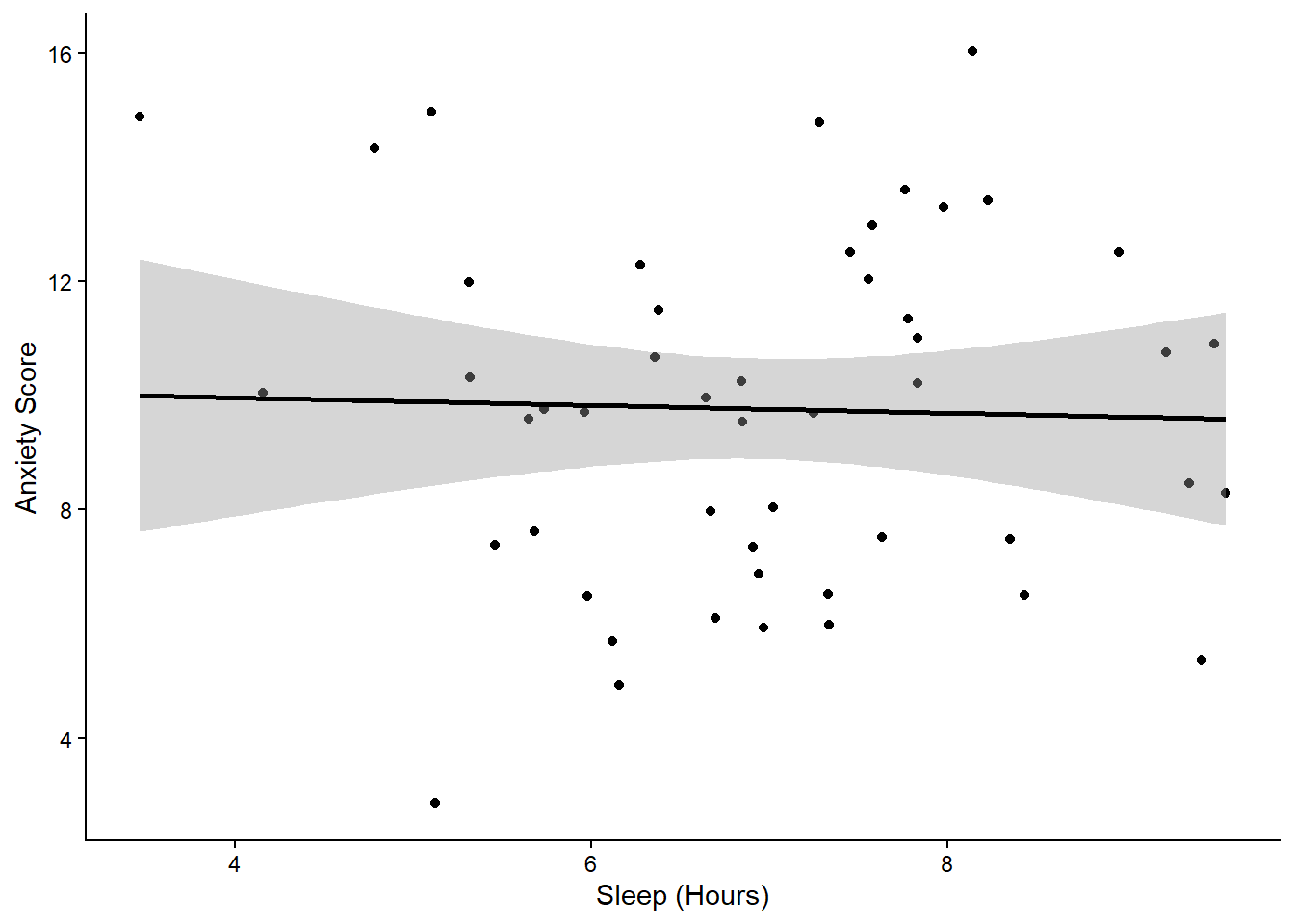
The mean anxiety score was 9.8. We found a significant negative correlation between sleep and anxiety, \(r\) = -0.03, \(p\) = 0.833.
Table 1: Descriptive Statistics
|
Sleep Status |
N |
Anxiety (M) |
|---|---|---|
|
Deprived |
13 |
10.00 |
|
Sufficient |
37 |
9.69 |
Figure 1
Course Complete
You have learned the Modern Psychologist’s workflow. 1. Clean with tidyverse. 2. Format with flextable. 3. Visualize with ggplot2. 4. Publish with Quarto.